I feel that the paintings of the bananas, on the right page, from the top sketchbok particularly stand out to me as they are very similar, but have quite different effects on the viewer. This is because they are executed very precisely with the paints and the way in which artist has used light and shadows. The use of the background on one of the bananas is especially effective as it changes the entire mood of the paintings, with the brown backwash giving a more focused feel to the fruit.
I agree with your appraisal Andre, the contrast of the background and the light and shadow on the bananas make this a really interesting study. Thank you for your comments!
The 2nd piece of work... the one that has a painting of the fruit and paints show a great understanding of the elements of tone of the different fruits. I like the paint pallet the most because it is a bit different to the original version. Moreover, the painting in that makes it more realistic than the original version. The background shading adds more texture to the piece and more emphasis on the main part of the work.
This is a study of an Audrey Flack painting Cil. You have observed well to notice a greater contrast in the study than the original artwork. Thank you for your comments!
I really like number 19, the Robert Indiana "Love" sculpture page. I love the colours used and the fact that the person had painted the "love" sculpture on top of a photo. Although, I think the photo maybe could have been something completely different to the original picture, as it was of a city background too. I feel this person has still kept their own kind of touch to the page as well as keeping the theme of Robert Indiana which I like, because it doesn't appear superficial or too made up.
Excellent appraisal, thank you Maria. This double page spread on Robert Indiana profiles the artist and his work well. I agree that painting the study of the artwork on top of a location photograph is effective.
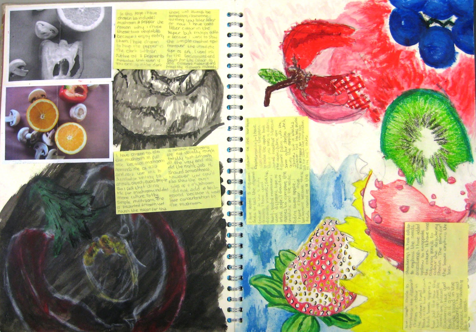
I think that the number 4 stands out to me, the one with the black and white oranges. I like how only black and white paint to show oranges and the fact that they have used different materials (like masking tape) to emphasize the the lines on the oranges. I think they have looked at the oranges very carefully because they have used different tonal shades of black, and to make it more realistic they have used white paint to show where the lighter areas. I feel that they have used the background wisely by filling it in with colour rather than just leaving it blank. However I do think that some annotations would make the art work better and it would give them a chance to achieve a higher grade.
Brilliant critique Neha, thank you! This artwork does show excellent use of materials and tonal range. The piece also has great composition and would indeed benefit from an artist annotation to explain intentions.
I think number 17 stands out amongst the pieces of art work. I think that the bold colours really draw attention to the picture and the each flower in the picture. I really like how there was no black used to create the shade and shadowing, just darker shades of the colours used. This then makes the artwork naturalistic and gives each flower depth; the way the colours have been layered in each of the flowers also gives a delicate texture to the artwork. I also think the simplicity of the work is very striking in contrast to the other pieces of artwork.
I am in awe over the different artworks posted here, especially the double-page spreads! As a result of looking at these artworks, I have gained myself a few constructive notes for my own artworks. Suitably filling any white blank spaces is definitely something that I will consider doing to my double-page spreads in order to achieve the eye-catching results I see from the double-page spreads displayed above. The painting showing the bananas and paint brushes, have also inspired me to experiment with more ways of showing texture on a page. Though it might just be a matter of taste, I think that the 'slightly smudged' effect has been executed really well on those paintings. Quite notably, looking at these artworks has reminded me to always try and finish my artwork to its fully completed state!
This is a wonderful comment Farah. Thank you for explaining how you have you have been inspired by your classmate's artwork. This demonstrates that you are reflecting on your own practice well and I look forward to seeing the results!
The different types of art work , add to my understanding of colour and texture as well as being able to understand how art can be presented in different ways. The double page spreads of Claes Oldenburg's art demonstrate the different ways of using colour as well as the different ways of using font to show style. As there are many different Claes Oldenburg double page spreads, each one of them has used paint in different ways and it is clear that acrylic paint has been used as it is shown through the texture of it. The paintings are eye catching as they are all bright and use up the whole page even double pages to give a more detailed understanding about the artist and his work.
You have done well to notice the differences in the approaches to studying and presenting Oldenburg's artwork in the double page spreads. Hopefully you can gain confidence from seeing that there is no 'correct' way to approaching these tasks and this can inspire your own artwork. Thanks for your comments Nadine!
The seventh one up resonates with me, and for that reason I feel compelled to rank it as one of my favourites. It's colourful and creative and eye-catching and makes good use of tone and stuff. There is also a fair bit of information in it, which is... good. It is, however, the several subtle details that makes this piece so damn tear-jerkingly beautiful - the references to this utopian haven called the internet, the 'idols' flag, and is that a 'fandom~!' I see lurking near the bottom? But. I do have some constructive criticism. The tumblr icon is wrong. WRONG. The person who drew this probably knows what the logo actually look like, so... C'mon. Give the site the respect it deserves. But yeah. S'good.
I really like the double page spreads about the different artists like Claes Oldenburg and Robert Indiana because the use of colour really stands out to me and has given me much more understanding in detail about their work. I like how lots of different materials have been used like acrylic paints, water colours and colouring pencils.
Hеllο would you mind shаring which blog platform уou're using? I'm planning to start my own blog ѕoon but І'm having a difficult time selecting between BlogEngine/Wordpress/B2evolution and Drupal. The reason I ask is because your design seems different then most blogs and I'm lookіng fοr ѕomethіng comрletely unique.
Ρ.S Apolοgiеs for being οff-toρіc but I hаԁ to аsk! Here is my page ; new mom clothes


I feel that the paintings of the bananas, on the right page, from the top sketchbok particularly stand out to me as they are very similar, but have quite different effects on the viewer. This is because they are executed very precisely with the paints and the way in which artist has used light and shadows. The use of the background on one of the bananas is especially effective as it changes the entire mood of the paintings, with the brown backwash giving a more focused feel to the fruit.
ReplyDeleteI agree with your appraisal Andre, the contrast of the background and the light and shadow on the bananas make this a really interesting study. Thank you for your comments!
DeleteThe 2nd piece of work... the one that has a painting of the fruit and paints show a great understanding of the elements of tone of the different fruits. I like the paint pallet the most because it is a bit different to the original version. Moreover, the painting in that makes it more realistic than the original version. The background shading adds more texture to the piece and more emphasis on the main part of the work.
ReplyDeleteThis is a study of an Audrey Flack painting Cil. You have observed well to notice a greater contrast in the study than the original artwork. Thank you for your comments!
DeleteI really like number 19, the Robert Indiana "Love" sculpture page. I love the colours used and the fact that the person had painted the "love" sculpture on top of a photo. Although, I think the photo maybe could have been something completely different to the original picture, as it was of a city background too. I feel this person has still kept their own kind of touch to the page as well as keeping the theme of Robert Indiana which I like, because it doesn't appear superficial or too made up.
ReplyDeleteExcellent appraisal, thank you Maria. This double page spread on Robert Indiana profiles the artist and his work well. I agree that painting the study of the artwork on top of a location photograph is effective.
DeleteI think that the number 4 stands out to me, the one with the black and white oranges. I like how only black and white paint to show oranges and the fact that they have used different materials (like masking tape) to emphasize the the lines on the oranges. I think they have looked at the oranges very carefully because they have used different tonal shades of black, and to make it more realistic they have used white paint to show where the lighter areas. I feel that they have used the background wisely by filling it in with colour rather than just leaving it blank. However I do think that some annotations would make the art work better and it would give them a chance to achieve a higher grade.
ReplyDeleteBrilliant critique Neha, thank you! This artwork does show excellent use of materials and tonal range. The piece also has great composition and would indeed benefit from an artist annotation to explain intentions.
DeleteI think number 17 stands out amongst the pieces of art work. I think that the bold colours really draw attention to the picture and the each flower in the picture. I really like how there was no black used to create the shade and shadowing, just darker shades of the colours used. This then makes the artwork naturalistic and gives each flower depth; the way the colours have been layered in each of the flowers also gives a delicate texture to the artwork. I also think the simplicity of the work is very striking in contrast to the other pieces of artwork.
ReplyDeleteExcellent appraisal Elizabeth. This is a great choice for the very reasons you mention. You have explained yourself well, thank you!
DeleteI am in awe over the different artworks posted here, especially the double-page spreads! As a result of looking at these artworks, I have gained myself a few constructive notes for my own artworks. Suitably filling any white blank spaces is definitely something that I will consider doing to my double-page spreads in order to achieve the eye-catching results I see from the double-page spreads displayed above. The painting showing the bananas and paint brushes, have also inspired me to experiment with more ways of showing texture on a page. Though it might just be a matter of taste, I think that the 'slightly smudged' effect has been executed really well on those paintings. Quite notably, looking at these artworks has reminded me to always try and finish my artwork to its fully completed state!
ReplyDeleteThis is a wonderful comment Farah. Thank you for explaining how you have you have been inspired by your classmate's artwork. This demonstrates that you are reflecting on your own practice well and I look forward to seeing the results!
DeleteThe different types of art work , add to my understanding of colour and texture as well as being able to understand how art can be presented in different ways. The double page spreads of Claes Oldenburg's art demonstrate the different ways of using colour as well as the different ways of using font to show style. As there are many different Claes Oldenburg double page spreads, each one of them has used paint in different ways and it is clear that acrylic paint has been used as it is shown through the texture of it. The paintings are eye catching as they are all bright and use up the whole page even double pages to give a more detailed understanding about the artist and his work.
ReplyDeleteNadine
You have done well to notice the differences in the approaches to studying and presenting Oldenburg's artwork in the double page spreads. Hopefully you can gain confidence from seeing that there is no 'correct' way to approaching these tasks and this can inspire your own artwork. Thanks for your comments Nadine!
DeleteThe seventh one up resonates with me, and for that reason I feel compelled to rank it as one of my favourites. It's colourful and creative and eye-catching and makes good use of tone and stuff. There is also a fair bit of information in it, which is... good. It is, however, the several subtle details that makes this piece so damn tear-jerkingly beautiful - the references to this utopian haven called the internet, the 'idols' flag, and is that a 'fandom~!' I see lurking near the bottom?
ReplyDeleteBut. I do have some constructive criticism. The tumblr icon is wrong. WRONG. The person who drew this probably knows what the logo actually look like, so... C'mon. Give the site the respect it deserves.
But yeah. S'good.
I really like the double page spreads about the different artists like Claes Oldenburg and Robert Indiana because the use of colour really stands out to me and has given me much more understanding in detail about their work. I like how lots of different materials have been used like acrylic paints, water colours and colouring pencils.
ReplyDeleteArta
Hеllο would you mind shаring which blog platform уou're using? I'm planning to start
ReplyDeletemy own blog ѕoon but І'm having a difficult time selecting between BlogEngine/Wordpress/B2evolution and Drupal. The reason I ask is because your design seems different then most blogs and I'm lookіng fοr ѕomethіng comрletely unique.
Ρ.S Apolοgiеs for being οff-toρіc but I hаԁ to аsk!
Here is my page ; new mom clothes