
Featured student artwork from FEBRUARY 2013...
Year 9 students have been working on the finishing touches for their final pieces of the Human Rights project. This examples are by Franc and Kaloyan who are sharing their work in progress, we look forward to seeing the finished artwork!


These images are from Bhavini's sketchbook. These are both fantastic examples of the extended homework tasks which Year 7 have completed and in turn inspired their designs for their African masks. Brilliant artwork Bhavini, well done!


Featured student artwork from JANUARY 2013...
As Year 9 students are developing their ideas into final pieces for their Human Rights project, these images show how Khadija and Zenith have developed their monoprints by adding different materials such as chalk, charcoal and ink.


These artworks are just two examples of the wonderful artwork that Year 11 students are currently working on for their mock exam on the theme of 'Places'. Well done Lewis and Akshay!


Featured student artwork from DECEMBER 2012...
Year 11 students finished their Portrait project final pieces last month, as these fantastic examples from Farah, Elizabeth and Maria show. These students have been inspired by Andrew Salgado, Francoise Nielly and Francis Bacon in their projects.


Featured student artwork from NOVEMBER 2012..
Anya and Kiran along with other Year 9 students are progressing fantastically well in our Human Rights project. Students have been exploring use of different materials and processes such as collage and ink in their own research of different themes related to human rights.


Featured student artwork from OCTOBER 2012...
These are some excellent examples of artwork from Year 8 Pattern project. Students have completed their titles pages introducing the project and have been exploring ways to extend and develop their patterns. Well done to Lara, Mason, Gabriella and Sam for some great artwork!


Featured student artwork from SEPTEMBER 2012...
Year 7 students have began their African Masks project by creating a fantastic title page to introduce the topic. Well done for these brilliant title pages Alfie, Ben, Billy, Venessa and Sofia! These examples show excellent combinations of lettering and images arranged into interesting compositions.


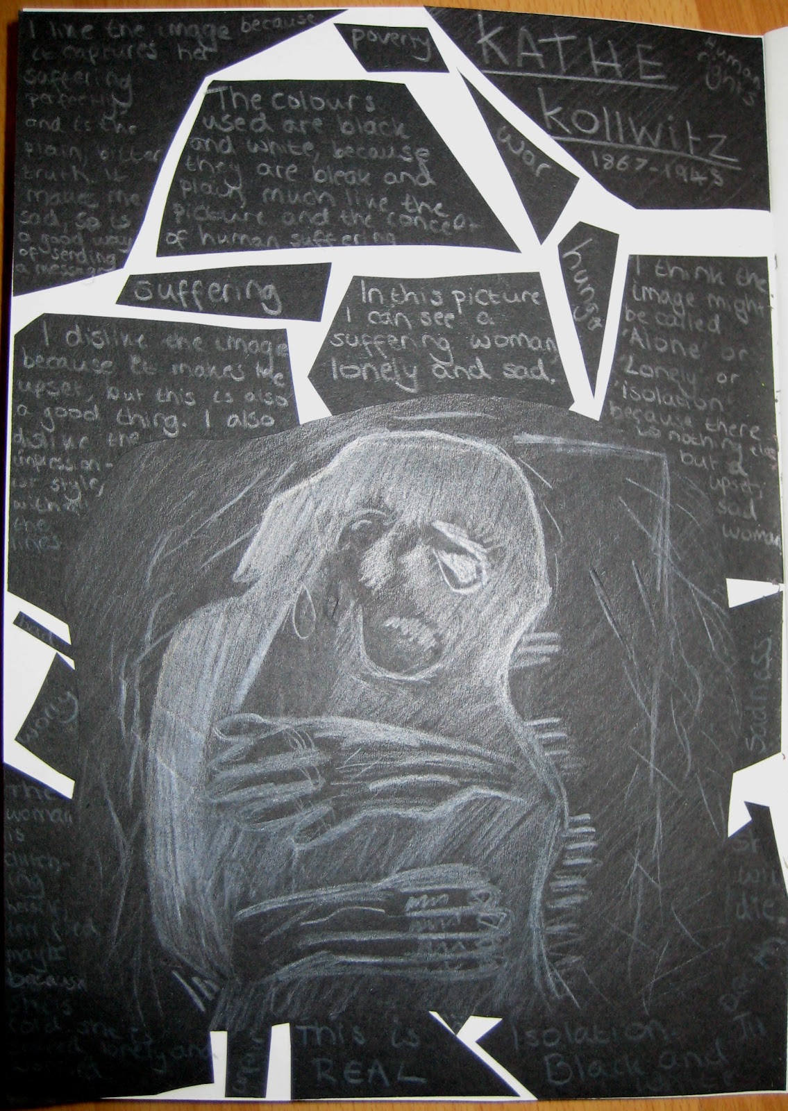
Year 9 students have began their Human Rights project. Students have been researching the topic before exploring the artwork of artist such as Kathe Kollwitz. Students have been inspired by their own primary source figure drawings to produce artwork using techniques such as monoprinting. Well done Chandni, Daniel, Alice and Kaloyan for these great examples!


☆ ☆ ☆ ☆ ☆ ☆ ☆ ☆ ☆ ☆ ☆ ☆ ☆ ☆ ☆ ☆ ☆ ☆
Featured student artwork from JULY 2012...


Year 7 student Gabriella completed a fantastic 'My Journey to School' homework. Gabriella documented her own journey to school by taking photographs of each stage and selecting key representative images to include in her presentation. Gabriella presented her work using her brilliant ICT skills over a double page in her sketchbook. Well done Gabriella!


Year 7 students Lewis, Naoya and Shanaz completed brilliant research on artist David Hockney as part of our 'My Journey to School' project. These students have used ICT software such a Photoshop to present their research in these fantastic brightly coloured layouts combining image and text in interesting ways. Excellent work Lewis, Naoya and Shanaz!


Year 10 students Maria and Marina have been exploring the artwork of Jennifer Martin. These images show their experimentation with Martin's technique of manipulating fashion images using paint. Brilliant work Maria and Marina!
cool
ReplyDeleteI like the 8th one because of the amazing colours that the person has used. I also like how they have lettered there art work and the patterns around it.
ReplyDeletei also like the use of colours in the pattern front page because of the way they contrast with each other
DeleteAll does drawings are really cool! The student artwork of the month really looks nice because of the different range of colors used. The human rights photos are really cool but I specially liked the photo of the planet and the two hands. Louis Naoya and Shanaz did really cool research too.
ReplyDeleteOne of my favourite pieces of work from this selection is the 8th piece down which was from the "Patterns" project. This Pattern title page in my opinion stands out a lot. It is very bold and I really like how the lettering is drawn in a swirly style. I think the way this person has drawn the flours in the background is very effective and I like the way they add a tiny bit of colour to the flours. I think this piece of work was created using felt-tips and I think its simple but effective. I think the piece is trying to show nature but without using that much colour and I really like it.
ReplyDeleteI like the patterns title page that has little colour but lots of curling vines. It is detailed and neat but it fills the whole page and doesn't look like the pattern is having to be stretched. It is quite simple looking however it looks delicate at the same time. If I was to improve this piece of work, I would add a light background colour and add a bit of colour to the actual pattern. Other then the colours, I really like this piece of work.
ReplyDeletemy favourite peice of art work is the pattern project because the work that the students produced are very creative and stands out. And usually when you think of patterns they can come across as quite boring but these particular patterns seem interesting and colourful which makes thier work really good. i also like the ideas that the pupils have thought of (e.x- hand with colourful flowers coming up the side.) it makes their work much more exciting!
ReplyDeleteMy favorite paintings are the human rights paintings. I like them because other paintings like the African masks are so colourful and he Human Rights paintings show the truth about the world.
ReplyDeleteI like the 8th one because of the amazing colours that the person has used in thier artwork. I also think its simple but effective and a very good painting
ReplyDeleteMy favorite piece of art work was the patterns because it was very imaginative and very good use of colors. The patterns were very thought out and also they were repeating again and again. They are really good.
ReplyDeleteMy favourite piece of artwork is the 2nd one down in the pattern project produced by year 8. I particularly liked this as the black outlining added emphasis to the detailed patterns and made them stand out. Moving on I love the way that the pattern has a theme to it which consists of black and red, I think that these colours complement each other and reveal every feature of the pattern it is extremely attractive the eye due to the effective colour scheme. Moreover it looks as if it has been thought through properly and is overall a beautiful piece of work.
ReplyDeleteMy favourite piece of art work was the African masks because it shows a variety of different masks and it shows that the people that created them really used there imagination. they where great.
ReplyDeleteMy favourite piece is the 8th one down because I like the way they have drawn it in black and white but added red tips at the end of some of the flowers. I also like the curve writing and the way that there is a gap between the writing and the flowers to make it stand out.
ReplyDeleteMy preferred piece of art from this vast selection is the third painting down. I like the way the artist has structured they’re painting adding striking contrast and sentiment between the expressions. Moreover, I particularly like the colour scheme reinforced within the painting, once again adding emphasis to the centre emotion. The use of watercolour creates a pessimistic and ominous mood of the art. In addition, I predominantly like the way each emotion is different within the three canvases. This portrays something within the painting and makes you question the appearance, its great!
ReplyDeleteI like the 6th one because of the use of vibrant colours and the way the colours compliment each other is great,
ReplyDeleteI like the 8th piece of artwork because it's very detailed around the lettering and the artist took their time to draw these images. I also like this peice of artwork because the lettering is very imaginative and bold because he/she has taken their time to outline the drawings and lettering. The colours he/she has chosen all go together and the little splashes of red really stand out and make the artwork exciting.
ReplyDeletei liked he patterns artwork they were very creative and they used very vivid colours.the patterns were repeated and very neat and filled the whole page there really great
ReplyDeletemy favorite artwork is the green and black one because it is simple but effective. i also like it because the artist took a long time and a lot of effort
ReplyDeletei like them because they're Colourful and decrotive 6th 1 down
ReplyDeleteI liked the 8th piece because it has a lot of decorations and the way they wrote pattern is very nice.
ReplyDeleteI like the 1st piece of work because it is very creative and she has used a wide viriety of colours. I think the material used was paint and I think she used a sponge and a brush. I think her inspiration came from Caren Ginsberg a famous abstract artist who created paintings similar to this one.
ReplyDeletei liked the 2nd piece because of the collage effect i also like gow the lips are a bit too big/plumpy on the face, it's a lovely detail
ReplyDeletemy favorite piece is gabriella's, because it has colour, pictures and some patterns.She has placed this picture on place's that she has been which is fantastic !. I like the way that she has sort of added a camoflarge?. she worked really hard on it and she should be proud . :)
ReplyDeleteI Like Anya and Kiran's pattern title page because it stood out from the others and a variety of colours have been used. Also the way they wrote "Patterns" makes it alot funkier! The colours they used work really well with the amazing design, I thing they have done a great job.
ReplyDeleteI like the 3rd piece because it has this glowing smudged, chalk, shadow effete and it suit with the dark shaded back ground.
ReplyDeleteI like the the last one because of the brilliant detail and the colours she chose. My favourite piece of the art work is the eyes
ReplyDeleteI like the first one as because of the use of the brown harmonious colours which really makes it stands out
ReplyDeleteMy favourite painting is the second last one made by the year 10's because...
ReplyDeleteIt is a very bold piece, this effect is created by the blue which is an unexpected colour to be chosen for the skin, this makes it look a-little like pop art. I also love the colours that have been chosen, blue and yellow, they really stand out individually. Because, they are contrasting with one another this makes it even bolder and effective, even though it’s only two colours that were used it really gave the artwork a controversial personality.
My favourite painting is the second last one made by the year 10's because...
ReplyDeleteIt is a very bold piece, this effect is created by the blue which is an unexpected colour to be chosen for the skin, this makes it look a-little like pop art. I also love the colours that have been chosen, blue and yellow, they really stand out individually. Because, they are contrasting with one another this makes it even bolder and effective, even though it’s only two colours that were used it really gave the artwork a controversial personality.
The Human Rights artwork is my favourite. It is appealing to the eye because the colours are vivid - they complement and also contrast one another. This artwork inspires me as it illustrates egalitarianism and reconciliation in the world. I like the fact that two hands – of different skin colours – joined together to form a heart in front of the earth show that it should be a world without racism. It reminds me about the last sermon of the beloved prophet Muhammad (Peace be upon him) who advised Muslims about human rights, and mentioned that no race is superior to another. The border is very attractive as it is filled with words displaying what an unspoiled world would be like. I also like the fact that the message is enriched through the symbols of peace.
ReplyDeleteMy favourite piece is 'my journey to school' because it is creative and colourful. I like the use of photographs layered as a collage.
ReplyDeleteI like Gabriellas 'my journey to school' because she uses a range of pictures symbolising all of the things she sees on her journey to school and in school. The way she sets the pictures out on the sheet is very eye catching because it makes you want to explore all of the pictures further.
ReplyDeleteMy favourite abstract is number one on the patterns topic. I like the way “patterns”, are written in the centre of the page; the use of landscape give the patterns more room to work with. Firstly, the font, which is graffiti, look which gives the font a vibe, which is independence. The bold and effective lettering has different patterns in each of the letters; this introduces that there is so many different types to choose from. The colour corresponds with the pattern texture and gives the lettering emphasis. Some are simple, some are complicated, and however, in both ways they are effective. In addition, there is an outline, which goes around the letters twice, which gives the lettering a bubbly effect; this makes the lettering a fearless end product. The patterns in which are in the background have many different types of colours which is adventurous and bright, which makes the abstract lively and full of freedom. To improve this abstract, you could try having all of the patterns in the background move in a certain direction with the colour. Meaning, the colour blends in with the direction which you want it to move it. For example, sideways. On the other hand, this abstract is a spectacular piece, which gives this piece of artwork character.
ReplyDeleteI liked the first piece of artwork. The portrait was very good. I liked the use of the colours because the colours and tones used in the skin went together harmoniously and blended well
ReplyDeletei like the human rights poster because i like the way the two arms are reaching out to each other i also like the writing around the border
ReplyDelete